The current ceramic project focus is on tiles. Though I love surface work, I have never manipulated ceramic material in quite this fashion. Here is a bit of inspiring visual research.
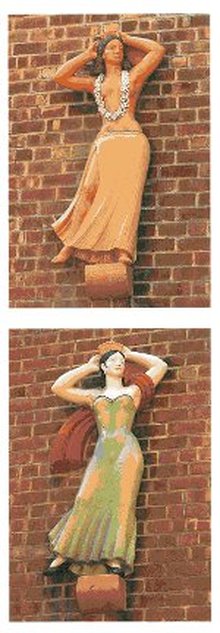 Parkchester Sculptures 1941 Terracotta
 These two terracotta ladies were put on the facade of the Parkchester residential buildings in the Bronx, New York during 1941. They are just two of 500 statues you can still see today. Its neat to see such playful poses gracing the outside of a building. They are almost suited to be a ship's figurehead statue. As they are in the same general pose, they must have been designed from an original mold, but were modified to fit the correct geographic representation of a woman - the Hawaiian hula girl and Spanish senorita. The colors of the tile are fairly subdued, but don't really need to be bold or bright. The subtlety of hue used lets the bodily stance and crafted movement of fabric be what moves your eye throughout. The muted cheekiness of these dancing femmes is incredibly appealing.
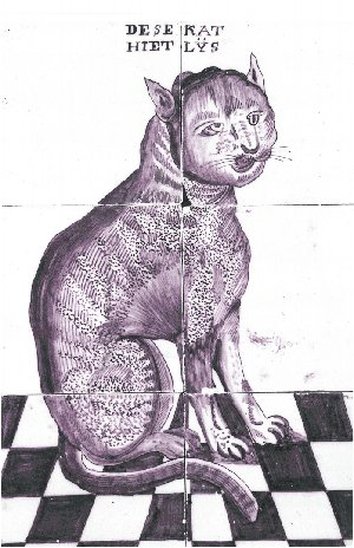 Dutch Tiles Later 1700s
 This arrangement of tiles is from Rotterdam in the Netherlands in the second part of the 1700s. The inscription translates to "This cat is called Lys." The Dutch were masters at representing the secular. Their work reaffirms what is in their world. Scientific study, including the relatively new Zoology, was more reliable and becoming more accessible to the populace during this time, and thus filtered into the artwork created.
What I enjoy about this piece is that though it is capturing something every day, it is valued. The subject matter might be boring to some, but the representation is fantastic! This is definitely not a realistic image of a cat, but this artist depicts a familiar feline in an interesting manner. They attempt to create the texture of the fur and other patterning on the coat. Its delightful in its simplicity. The straightforward text is a plus to me, but I, personally, like the incorporation of words and phrases in works. It probably extends from my love of graphic novels and advertising. The checkered pattern of the floor is the cherry on top. Its exactly what a kitchen floor ought to look like.
What I enjoy about this piece is that though it is capturing something every day, it is valued. The subject matter might be boring to some, but the representation is fantastic! This is definitely not a realistic image of a cat, but this artist depicts a familiar feline in an interesting manner. They attempt to create the texture of the fur and other patterning on the coat. Its delightful in its simplicity. The straightforward text is a plus to me, but I, personally, like the incorporation of words and phrases in works. It probably extends from my love of graphic novels and advertising. The checkered pattern of the floor is the cherry on top. Its exactly what a kitchen floor ought to look like.
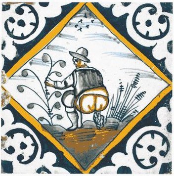 Dutch Tile 1600-1630
 This particular Dutch tile is from somewhere between 1600 and 1630. The corners are created using reserve technique, which plays with positive and negative using dark blue background and white design. The scene within the diamond shape is of a man defecating. That's a pretty grotesque thing to depict, but the Dutch did not shy away from representing even the most basic of human functions. Being able to discuss the secular through visual means, these artists often created low life scenes - of common people drinking, dancing, smoking, and even vomiting and urinating. Their honesty is pretty refreshing. Rather than sanitizing natural occurrences with bears or ladies in a quilting circles, they aren't afraid to show a man answering the call of nature. The simple color scheme and whimsical line work make it less abrasive or jarring and more about a moment captured. I am reminded of a recent road trip where my friend had to urinate before we found a rest stop. We pulled off to the side of the road so she could relieve herself. It was such a ridiculous situation we had to commemorate it with a photo in which she flashed a peace sign while peeing, It was just an occurrence that, for us, merited visual recording. I see this tile in a similar light.
 RSS Feed
